I created the identity for a high-end American eatery, RestAurant, that plays off of the periodic symbol for the element gold, “Au.” Because I centered my design on the scientific element, I stayed away from the flashy associations of showy wealth that often come to mind when thinking about gold, such as conspicuous jewels and objects. Instead, I drew from the purer, but still high-quality, properties of the element gold.

Thus, RestAurant is designed to be simple, classic, elegant, and “elemental” — pun intended. My full logo and branding marks are meant to be associated with the periodic table.

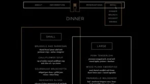
The black background of the branding speaks to elegance, as does the swashes of the italic serif and the clean thin lines of the display sans-serif font choices. A fully-coded website with menu design, as well as a mock Mother’s Day email campaign, are built to retain these branding qualities.


Above: a walkthrough of the fully-coded website.
Below: Mother’s Day email campaign.


I created the identity for a high-end American eatery, RestAurant, that plays off of the periodic symbol for the element gold, “Au.” Because I centered my design on the scientific element, I stayed away from the flashy associations of showy wealth that often come to mind when thinking about gold, such as conspicuous jewels and objects. Instead, I drew from the purer, but still high-quality, properties of the element gold.
Thus, RestAurant is designed to be simple, classic, elegant, and “elemental” — pun intended. My full logo and branding marks are meant to be associated with the periodic table.
The black background of the branding speaks to elegance, as does the swashes of the italic serif and the clean thin lines of the display sans-serif font choices. A fully-coded website with menu design, as well as a mock Mother’s Day email campaign, are built to retain these branding qualities.
Above: a walkthrough of the fully-coded website.
Below: Mother’s Day email campaign.